I constantly preach that your logo should accurately represent your business. After all, it’s often the first thing your potential customers will see. Your logo should be clean, professional, and strategic. It should be thought provoking…but not in a bad way.
Which brings us to a list of some of the worst logo designs I’ve found.
A-Style
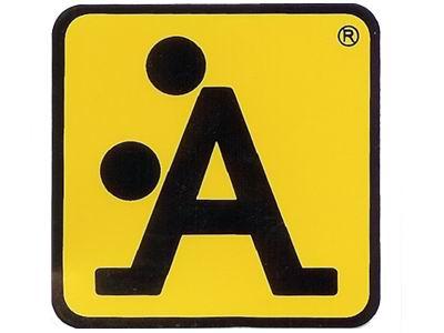
A-Style is an interesting study in business as it seems they did everything backwards. This leud logo, created by a young graphic designer in Italy, started showing up on sticker plastered to street signs and buildings. It became so popular that the creator eventually launched a short-lived fashion brand.
Mama’s Baking
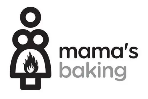
Um, what exactly is mama baking???
Bureau of Health Protection

I’m not really sure what the Bureau of Health Protection does, but I’m guessing they throw some really wild office parties.
Catholic Church’s Archdiocesan Youth Commission

How did no one catch this before it went pubic public??? I think the Church will agree, whoever designed this is going straight to Hell.
Locum
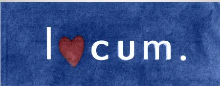
The logo for this Swedish property management company definitely got lost in translation.
Sun Rise Sushi

Get your minds out of the gutter! This is just the sun rising behind a Japanese Tea House.
Arlington Pediatric Center

Same scenario as the Church’s mistake above… placement is important. How do these make it through the final edit?
London 2012 Olympics
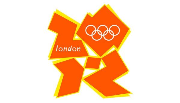
This logo cost £400,000, and created quite a controversy. When it was first displayed, some people immediately saw Lisa Simpson in a, um, compromising position. Others saw someone sitting at a computer (hopefully designing a better logo). A few others saw a swaztika. Iran actually threatened to boycott the Olympics because they thought the logo cleverly spelled out “Zion.”
Comprehensive Health Care
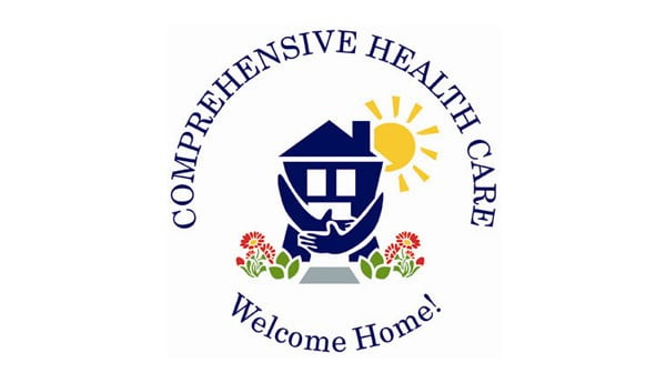
Oops! Sorry to walk in on you. I swear I didn’t see anything…
Doughboys
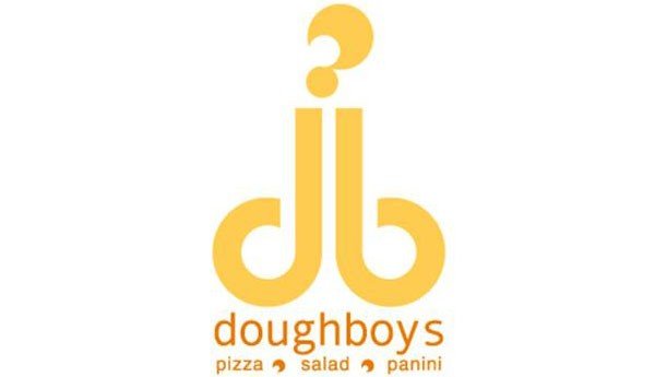
Yeah, I’m not eating that.
Junior Jazz Dance Classes

I understand the intention behind this logo… two young people dancing. The problem arises when you step back from the image and look again (hint: if you have trouble seeing it, cross your eyes just a little).
